Tuesday, March 10, 2015
Tuesday, October 28, 2014
The Book of Life
Here is another lighting key I did for the film. In this scene Joaquin proposes to Maria, a gesture that forces Maria to either be true to her own heart or to save the town she loves.
The environment, color, and lighting was designed to reflect Maria’s inner turmoil in the scene. Much like her inner state, these components are a stark contrast to the otherwise vibrant festive environments in the film and references the same visual language designed for The Land of the Remembered.
Monday, October 20, 2014
The Book of Life
This is one of many lighting keys I did for the film. They wanted the moon light to feel like it was shot day for night, spaghetti western style. This was a lot of fun to paint I really enjoyed playing with the warm and cool colors.
Saturday, October 18, 2014
THE BOOK OF LIFE in theaters now!
About a year ago I had the pleasure of working on the feature animated film The Book of Life. I am so excited I get to finally share my contributions to this vibrant and wonderful world. Keep checking in, I will be posting more work soon!
Monday, October 13, 2014
Sunday, August 10, 2014
The Drawing Club: Master the Art of Drawing Characters from Life

The Drawing Club: Master the Art of Drawing Characters from Life by Bob Kato. Bob taught me the most important things I know about drawing and design and all of them are in this book. I am very lucky to be a part of it!
Tuesday, February 25, 2014
Friday, December 06, 2013
Wednesday, October 30, 2013
Frosted Wendi-O's
Did this one for a contest over at Strange Kids Club!
Update 11/4/13: This entry won 1st place!
Starnge Kids Club Cereal Monster Mascot 2013 winners
Monday, October 21, 2013
Thursday, September 19, 2013
Tuesday, April 02, 2013
Dia De Los Muertos
During the celebration of the Day Of The Dead in an old Mexican city, a boy and girl skeleton lock eye sockets and in that moment fall in love.
|
Thursday, March 21, 2013
Wednesday, December 19, 2012
The Fall of the House of Usher
Friday, November 02, 2012
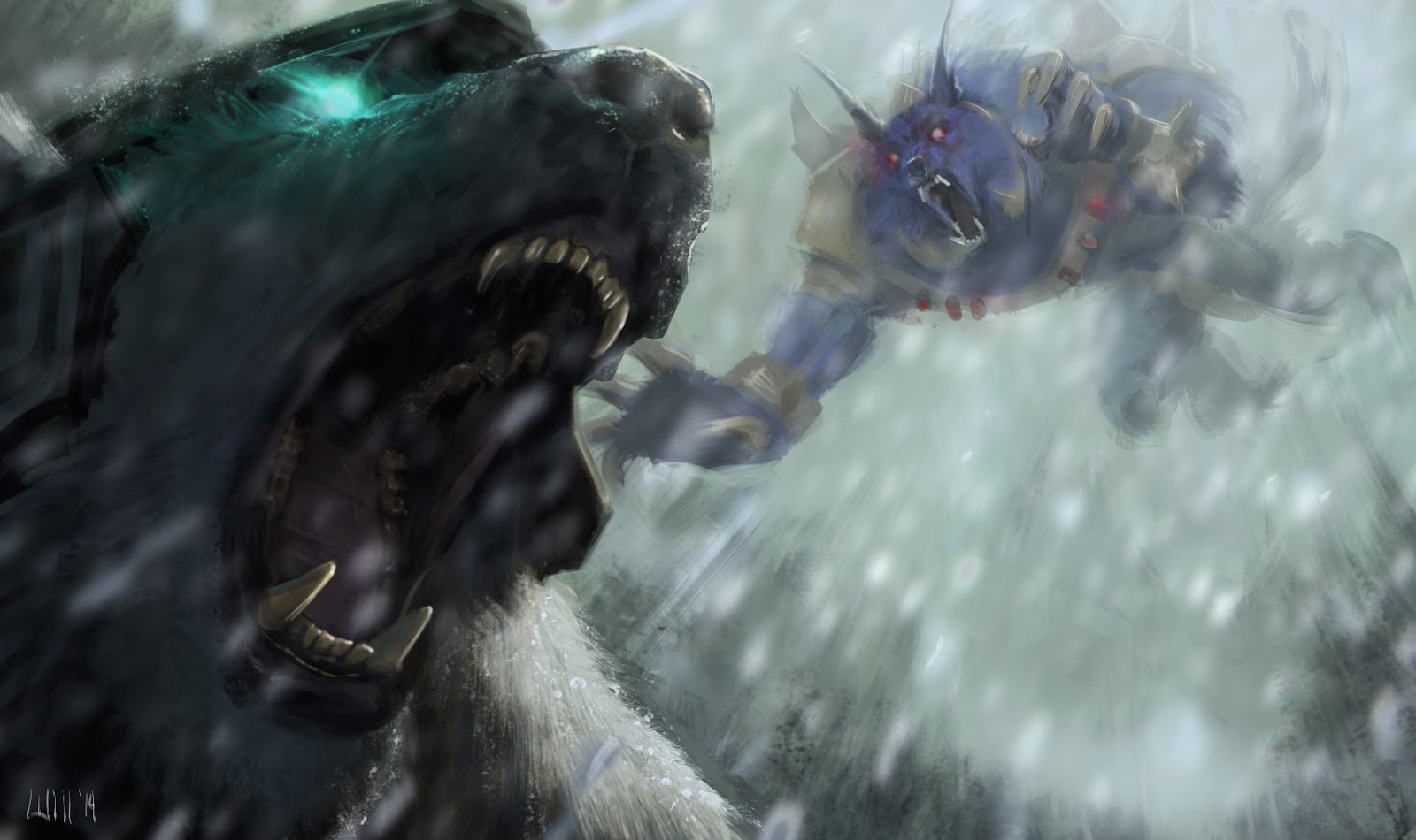
I WAS A GRANDPA WEREWOLF! TUTORIAL!
This is where we are heading...
After some very quick ideation sketching I did this rough. My main considerations here were character and communicating the concept. I already had an idea for lighting but instead of indicating it in this sketch I focused on just concept and communication.
After feeling confident about the design I moved into detail and refining and designing. Here I made little visual notes to remind me of what I want to do later on in the rendering. I want to "keep something in the tank" and leave some exciting bits to be explored, I don't want to figure it all out yet. I find this keeps me interested and leaves room for happy accidents and surprises. I make sure to save a flattened copy of this on a multiply layer to refer to once I start painting.
My next step was to drop in a color ground and begin blocking in large forms. I begin painting under my drawing to maintain the integrity of the design, I also let the ground show through in places for variety. I paint on top of the drawing when I want to make the form more 3-D. I find this helps maintain the original character of the drawing.
The swatches are there to help me maintain the color relationships I want.
I am only concerned with the lighting coming from above at this point. It is easier to concentrate on one light source at a time.
You may have noticed that I flipped the canvas. I do this to get "fresh eyes" on the painting. At this stage I lay down a rough blocking of the lighting.
This a close up of the refined cyan light source.
I have been reading about Howard Pyle and how he used to edit his paintings down to what was only necessary. At this point I asked myself "what is the cane doing for me? Does it help tell the story? Is it distracting?" I decided it wasn't doing a whole lot so I added a smashed jack o' lantern. I dropped in a white layer on %60 opacity and drew on another layer on top. I want to see enough of the composition to make the pumpkin work but not so much as it distracts from my drawing the new element.
This is an example of me checking the drawing against the painting using the same method I described above.
The finish! I hope this was helpful, if anyone would like to know about anything I haven't covered here just ask.
The swatches are there to help me maintain the color relationships I want.
Tuesday, October 30, 2012
Wednesday, September 12, 2012
10 minute digital paintings
These are some 10 minute paintings I did using a great website that is basically a drawing workshop online. You have a variety of subjects to choose from: men and women, costumed or nude, and animals. you can also choose the length of time each slide is held from 30 second to up to 10 minutes. They also have what they call a class which range from 30 minutes to 6 hours where you are given short poses which build to longer ones. check them out!
http://www.pixelovely.com/gesture/
Thursday, July 19, 2012
Monday, May 21, 2012
Monday, May 07, 2012
Subscribe to:
Comments (Atom)


